

The problem
Biopet rebuilt its storefront, customer accounts, and internal admin dashboard in one go. Reviewing the logged-in areas in real sessions through the Inlyne extension cut two weeks off the launch.
Biopet was rebuilding everything at once: a new storefront, a customer account area, and an internal admin dashboard for the team that runs the shop day to day. Three surfaces, one launch date, and feedback scattered across all of them.
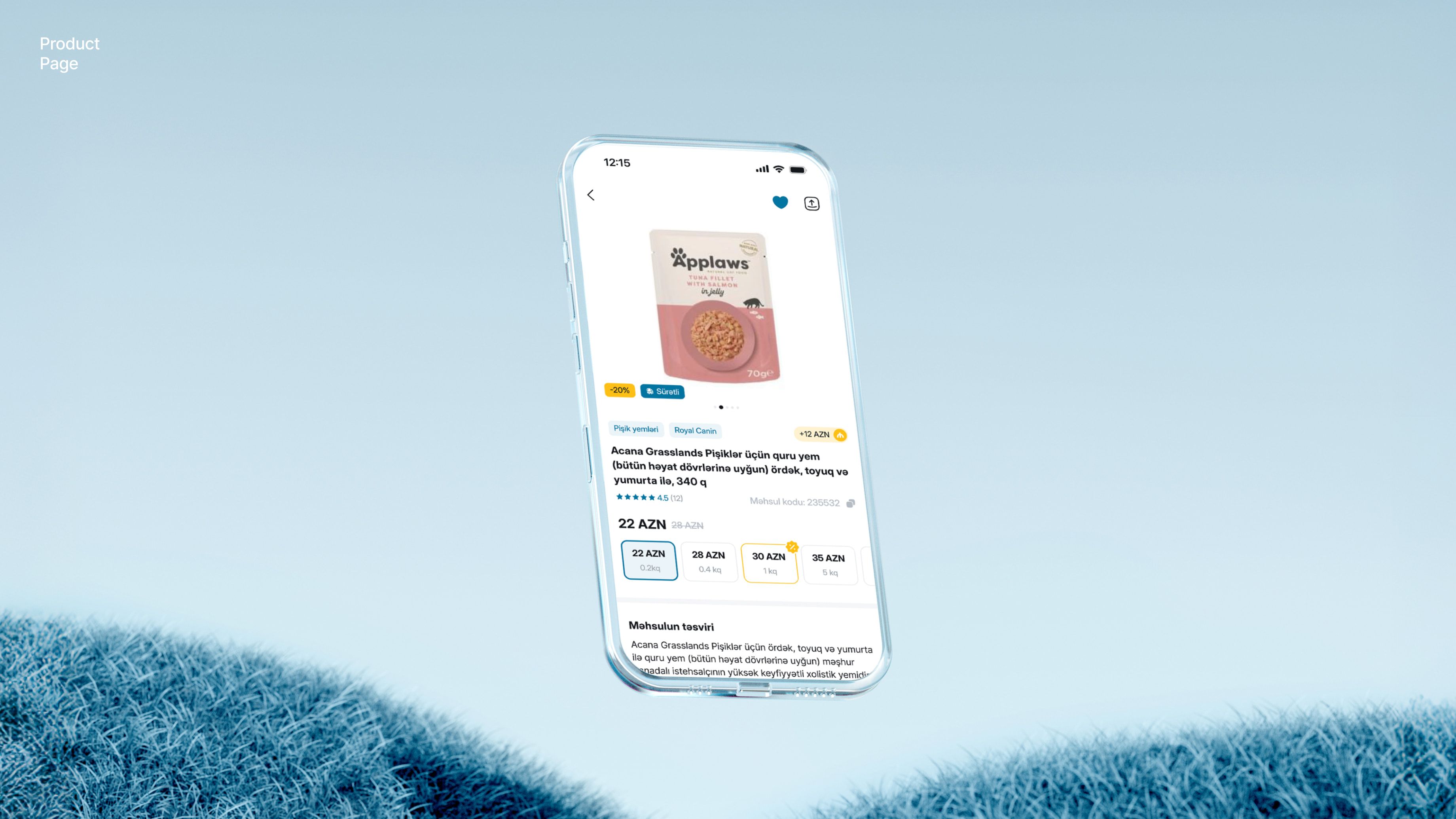
The storefront was the easy part: anyone could open the staging link and point at things. The hard part was everything behind a login. The account area only made sense with a real customer session: saved addresses, order history, an active cart. The admin dashboard only made sense to the staff who would live in it, with stock states, order queues, and discount rules. Screenshots of those screens stripped out exactly the context that made the feedback meaningful: which account, which state, which step of the flow.
So feedback on the logged-in areas arrived the worst possible way: photos of monitors in a group chat, verbal notes from the shop floor, and a list re-typed by whoever collected it. The developers rebuilt each report from fragments, and small issues in the flows customers and staff would use most were exactly the ones likeliest to slip through.
How they use Inlyne
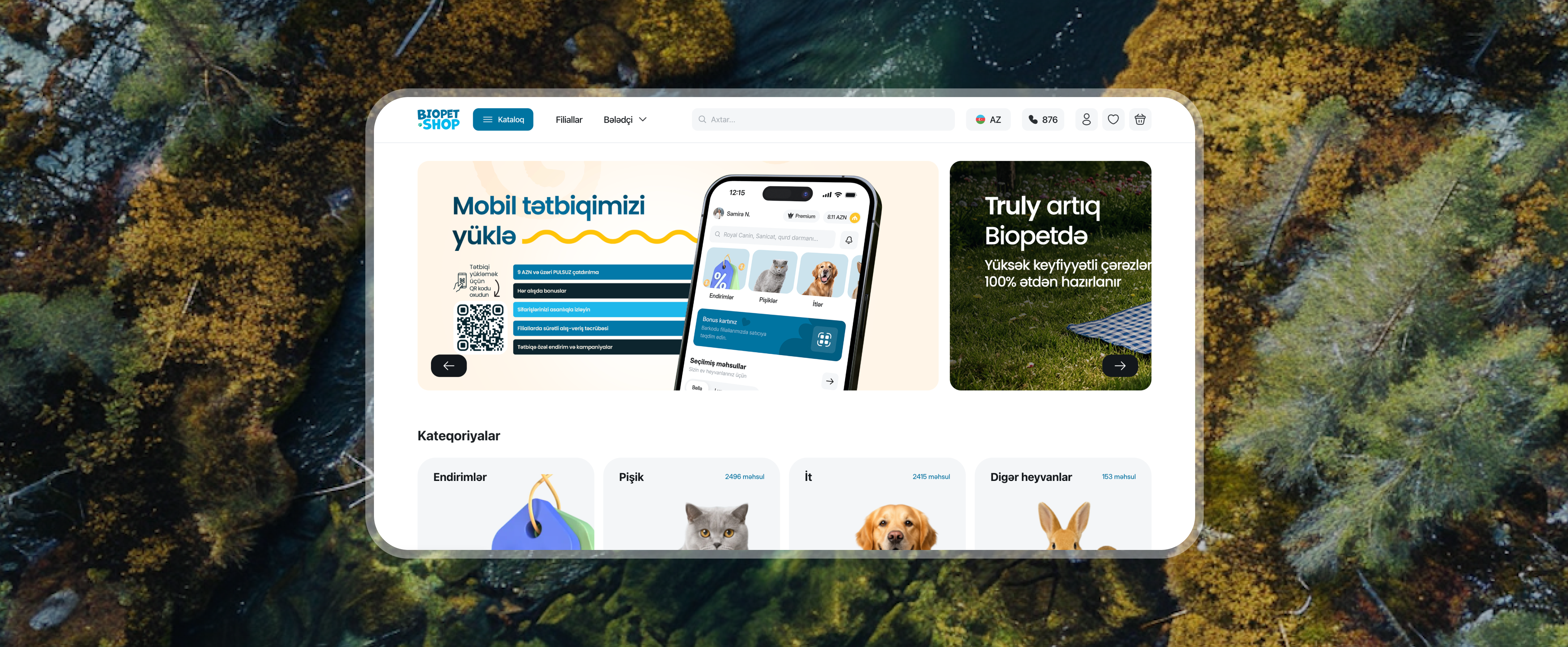
The staging site got the Inlyne script, which covered the storefront: anyone on the team opens the share link and pins comments on the live pages. For the account area and the admin dashboard, the team uses the Inlyne Chrome extension, so reviewers comment on the real page in their own session, logged in as themselves, with the exact account state the issue happened in.
That closed the gap no screenshot ever could. When a staff member hits a confusing stock view in the admin, they pin the comment on that view, in that state, and the developer sees the page, the element, the viewport, and a screenshot of the session as it actually was. "The order screen looks wrong" became "this column, on this screen, at this width, with this data."
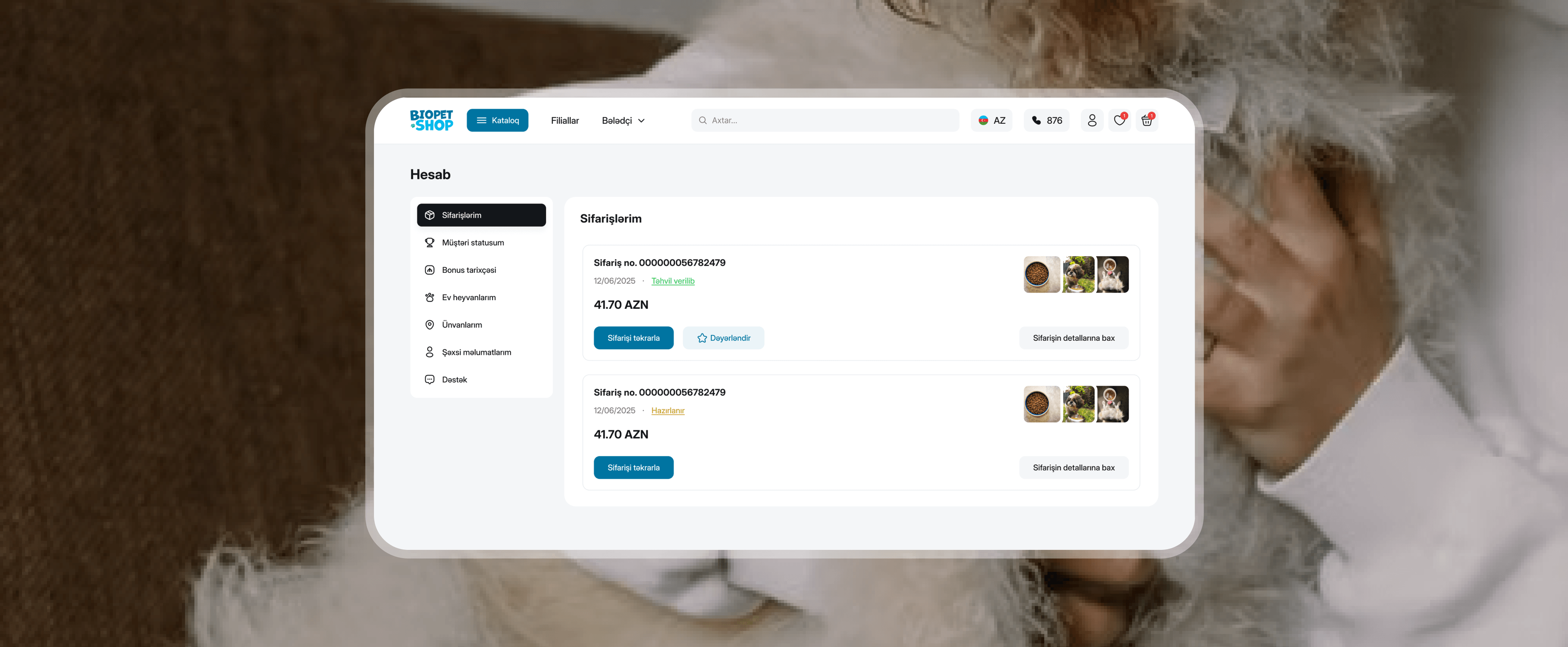
Review stopped being a phase and became a habit: shop staff commented as they trialed the admin in their daily work, customers-eye reviews ran through real test accounts, and the developers worked through one list, resolving pins as fixes shipped.
The result
The relaunch landed about two weeks earlier than the original plan, mostly because the feedback loop on the logged-in areas collapsed from days to minutes. Roughly 60% fewer visual and flow bugs survived to launch, and the ones that did were caught in the first week live, through the same pinned-comment habit.
The admin dashboard shipped as a tool the staff had already shaped, not one they were handed. And the review setup stayed on after launch. New features on the storefront and admin go through the same loop, which means the new site keeps improving the way it was built: with the people who use it pointing at exactly what they mean.